NayaPay Unveils Bold New Brand Identity and Revamped App Experience
- Sara Habib
- July 1, 2025
- 11:43 am
- 50
- Technology
NayaPay Rebrand Strategy is now live, marking a big shift in how this fintech platform presents itself. The company launched its new look and app upgrades as it aims to become the top financial service in Pakistan. With over 2.5 million users, NayaPay is ready to scale even higher.

Bold Design with Global Influence
NayaPay worked with global agency Koto to reshape its visual identity. Koto also helped Amazon with a recent brand refresh. Together, they created a fresh logo, vibrant colors, and sleek fonts. These elements bring energy and connection to the user experience.
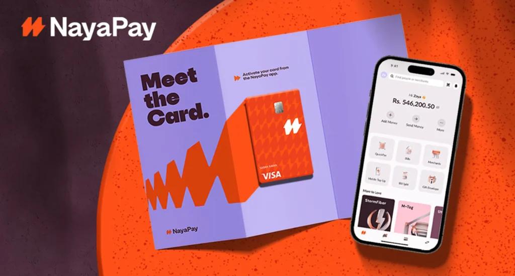
The core symbol, called Dyno, is made of arrows pointing in different directions. It shows the flow of money and movement. Paired with a bright new color—Electric Orange—it gives NayaPay a powerful, modern look.
Better Experience for Every User
The app is not just prettier—it also works better. The upgrade includes a smoother interface and improved features. The Visa Physical and Virtual cards now follow a vertical design. Icons and typography also follow a metallic, currency-inspired style. Every update is focused on ease and speed.
More Than a New Look
NayaPay made it clear: this is not just about design. It’s about setting a new direction. As they said, “It’s the launch pad for everything we’re building next.” New updates will come in phases. Users will see the changes soon in their apps.
What This Means for Pakistan
Fintech is growing fast in Pakistan. NayaPay’s rebrand shows how local platforms can lead with innovation. With better design and smarter features, it becomes easier for users to trust and use digital financial services.
Koto Design Studio – for more on the agency behind the rebrand
NayaPay Official Website – explore the new look and features
Visa Card Services – learn about global card standards

